Showing posts with label G324 Research and Planning Print Productions. Show all posts

Wednesday, 27 February 2013

Feedback for Digipak - revisions completed


 Panel 1 - Little change has been made to this panel due to the advice being primarily focused on the advert and back panel. However, as the people who  reviewed my digipak are from the specific age demographic for the target audience it was useful to look at the feedback may it be positive or negative. Several comments that came up about this panel mentioned the colour range, for instance

 "The colours of both the dress and curtain clash, suggest creating those curtains in a lighter colour"

"up the contrast on front cover - brighter colours"

"the use of plain text is appealing"

-In response to the feedback given from the specific age demographic my digipak is aiming for, I decided to up the contrast a touch for the front cover just so that the red of the curtain pops out more. However, due to the minority suggesting that the colour of the curtain should change I decided to keep it the same, especially after asking others what they think and them disagreeing with the view that the different shades clash.


This is panel 2,3,4 and the main comments that cropped up about these panels was that I should up the contrast on the images in order to achieve a more vibrant effect, nevertheless the photographs were liked by some. Others felt that the right panel stood out too much, however the idea of the panel is for panel 2 and panel 4 to be overly contrasted thus representing the contrast between illusion and reality in the music video. Therefore, I didn't take the right picture out as it linked the digipak and music video together by telling the story of the music video.


The only comment made about panel 5 was that there was a spelling mistake which needed to be changed so  I made sure to correct that. 


The magazine advert that I made was criticized as being "too grainy" this was because I used an effect on Photoshop called 'Bevel and Emboss' due to thinking it would enable the advert to achieve an edgy look. However, it came out looking like the photograph is of bad quality and as many people commented on that when reviewing the advert I made sure to change it back to normal.


Suggestions made to improve this panel:
-"move image up slightly to fill space, or move down"
-"make the advert in colour instead of black and white"


Here is the final magazine advert with revisions.
-"If the person in the photograph was in colour but the background kept black and white it would have more effect"   - After reading the suggestions I decided to try and make it so that there was a bit of colour in the advert but not so that it is overly bright. This achieved a more appealing look and was the happy medium as it shows a hint of colour without being in your face and is a lot more interesting to look at than the dull black and white one as shown above. To some extent, it also reflects the notion of nostalgia which is portrayed in the music video, and related to the album cover name and title of the song 'Antiques' as it is slightly in sepia so therefore gives off a vintage like feel. 


Tuesday, 5 February 2013

Final digipak design and magazine advert

PANEL 1 - FRONT COVER


PANEL 2, PANEL 3, PANEL 4.


PANEL 5


Magazine advert


Saturday, 2 February 2013

Digipak planning - photographs for final design and magazine advert

PANEL 1

This is a practice shot for the front cover of my digipak. In
order to achieve the theatre curtains look I will make my own mini
curtains out of a rich red material and enlarge them when on Photoshop
so they will look similar to those shown above. The photograph
of the bunny peeping round the wall will be used on one half of the
cover and will look as though the bunny is peeping around the curtain.
On the other side, I will take a photograph of the girl from the music
video peeping round the same wall in the red gingham style dress, and
she will be looking round the other side of the curtain.  Furthermore,
to reference to the silent movie style of the music video the background
behind the curtains will be of a circular shape which references to how
silent movies would begin, and to how our own music video began.


Finished front cover of digipak.


PANEL 2 AND 3
For the 2 panels on the far right and far left of the digipak when it has been opened, I have decided to include a picture of the girl from the beginning of the music video walking down the steps of the 'wonderland' on the right side. Therefore, on the left there will be a picture of the contemporary girl she has transformed into walking down the steps of the modern world she is now in. This relates to the ideas of Claude Levis Strauss' theory of binary opposites, this is due to the fact that the brightly coloured costume and the nature surrounding the protagonist in the first picture contrasts with the dull looking grey steps and the dark colours of her costume in the second picture. Thus indicating that the panel's are reflecting her good and bad personalities, the first being her good personality as she is surrounded by a beautiful environment, the second picture showing the harsh realities of modern day life which she is not used to.


PANEL 4

The plan for this one is to have a birds eye view shot of the red clothed table which is featured in the beginning and ending of the music video. It will include the box that the protagonist opens up which reveals the infamous bunny rabbit, also the 'drink me' bottle as well as the playing cards. This photograph will be featured where the CD will be placed and will be centered between the girl in the wonderland and the adventure in the modern day world. This therefore suggests that the root of the transformation is the events that occurred whilst she was sitting around the table, the drinking of the unknown liquid as well as opening up the little brown box.


PANEL 5


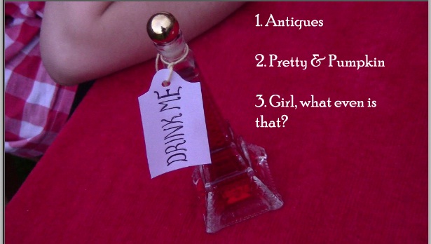
 The original idea for this panel which will include the track list was to have a close up picture of the 'drink me' bottle which is shown on the table and have the song titles next to it. However, a better idea was suggested in order to achieve a more effective and eye catching back panel, which is to have the track lists actually on the bottle of drink. This will mean that a closer shot of the bottle will be needed in order to fit the song titles on. However, due to the narrow size of the bottle it was difficult to include the whole bottle in the shot and have enough space for the tracks to go on the bottle. So, therefore I decided to have a photo of the bottle similar to the above and include the tracks on the side.


OR..


Magazine advert photos.
This is the photograph I have chosen for the magazine advert, in reference to our music video this shot was taken  during our filming process and is when the girl is leaving the wonderland she was previously in and entering the modern society. I have decided to change the effects of the photo and make it black and white with a hint of colour particularly on the dress. The reason behind the bleakness of this image is the fact that it is representing the grim world she is entering into contrasting to the bright colours featured on the Digipak which show the 'wonderland'.


Here is an updated version of the magazine advert, first
of all I decided to add a little more colour to the advert
to make it more aesthetically pleasing and for it to show
up more in a magazine. Furthermore, I decided to include
the album cover in the bottom right hand corner as the aim
of the advert is to promote the album so it is important to
show the actual album cover. In reference to the text on the
advert I haven't as of yet decided what quotes to have on
it but the source of the quote will be from the film magazine
called 'Sight and Sound'. This is because our music video
is to some extent aimed at film lovers due to its intertextual
references to texts such as 'Alice in Wonderland'.


Monday, 28 January 2013

Final idea for digipak


Photographs from shoot for potential Digipak panels


This is a photograph from the shoot of the city section of our music video, the idea was to have the graffiti on the back panel of the music video where the tracks our. However this idea will not be used as there would be too much writing covering the panel and it isn't as effective as another idea I have chosen. This other idea I will use is to have a close up of the 'drink me' bottle and the tracks shown on the bottle.
This particular photograph was a possible idea for the panel where the CD will be placed. This was thought of because the table scenes in the music video are what connects the two different worlds the girl enters. However, instead of this shot I have decided to take a birds eye view of the table meaning that it will be the shape of the CD. This is appealing as it will look more effective and works well in the centre of the digipak.

As I have decided to create a six panel digipak an initial idea was to have the girl from the modern society on one side and her 'vintage' self on the other side both looking at each other. This will show the contrasts of the different worlds she has entered into. However, an issue of using a close up of both of there faces looking at each other is the fact that there isn't any significant factors suggesting whether she is in the modern world or not. Therefore, instead I will include a full length picture of the girl in both costumes in order to notice the different worlds she is in. 

Wednesday, 9 January 2013

Digipak initial ideas

 This is the initial idea for my digipak, firstly I decided to stick to a CD size for our digipak this is due to the fact that we decided that it would be more suitable for our artist's music and the design works well with a CD size. This will be the single of the song 'Antiques' which is played in our music video. Furthermore, my first idea was to have a photograph of the protagonist of our music video laying down on the grass in the plantation gardens fast asleep. This idea references to the painting of Ophelia by Sir John Everett Millais as shown below.


This is also referenced in the video by Florence and the Machine 'Rabbit Heart' where Florence is shown at the end of the video laying on the table in the water. However, the issue with using this idea on our front cover is the fact it is a passive representation of gender,and the fact that the female on the cover is not being heavily shown.


Another text that has inspired my initial idea for the front cover is the opening to the first film made of Alice in Wonderland in 1903. Alice is shown lying on the grass in this shot with the title shown above her. Although this may show a passive representation of gender, it fits with the style of the video as the whole idea of the story is the fact that she wakes up to a wonderland, a dream like place.


For the second page of the digipack I had the idea of having a shot of the protagonist of our music video standing next to the graffiti on the wall which is featured in our music video. However, it will differ from the shot in our music video as the girl will be holding the rabbits mask. The reason that the digipak will open up to this shot is to create a time shift effect to the digipak. As the front cover will be a photo of the protagonist of our music video in the gingham dress featured in the first part of the video. The second panel will be her changing into the modern day costume showing the transformation of two different eras, the 'wonderland' to the modern day society.

The third panal of the digipak could be a telescopic picture of the artist 'Billy Lubach' who created the music for our music video. The reasons behind the telescopic effect is the fact that it works well with the Alice in Wonderland theme, for instance it is similar to the idea of  seeing 'through the looking glass'.


Here is a screen shot from the edit of our music video and this telescopic effect of the character in our video is the effect I would like to achieve for the photo on the CD.


For the back of the CD the tracks will be on the bright red table featured in the music video as well as some of the objects from the table such as the 'drink me' bottle. The bunny rabbit will be peeping into the cover similar to how it is subtly shown throughout the music video. 


The second idea of mine is to have the front cover of the digipak similar to the beginning of the music video where it opens to a shot of a young girl sitting behind a table with various objects featured on the table. The font for the song title 'Antiques' and the artist's name 'Billy Lubach' will be shown in a vintage style font similar to the font 'Octin Vintage' which i found on 'dafont.com'.


For Panal 2 + 3 the idea was to have one world facing another, for instance the world that the young girl is trapped in in the beginning of the music video, the 'wonderland' will be facing the modern world that she travels to where she is facing the contemporary society. Therefore, this will be representing Claude Lévi-Strauss's theory of binary opposites as the costumes, mise-en-scene and overall look/colours of both the panels would be contrasted. The dark colours of black and purple in the costume from the modern world contrast with the white and light red gingham style dress. 


There will be buildings shown in the background on panal 3 representing the industrialized society which contrasts to the simplicity and tranquil feeling of the mise-en-scene in panal 2.


Extra ideas 

Another idea for our digipak was to have six panals in total instead of 4, therefore for the 2 panals that open to reveal the CD I will use a photograph of the girl from the vintage era on the left one and her in the modern world on the right both facing each other. Furthermore, the back of the CD where the track list will be could feature a close up photograph of the 'drink me' bottle from the music video and the song titles could be written on there.